Saturday 30 April 2011

7. Looking back at your preliminary task, what do you feel you have learnt in the progression from it to the full product?

The Preliminary Task

The preliminary task of the production was to create a school magazine front cover. This allowed me to become familiar with the technologies and conventions of layout and design.


You can see some similarities between my preliminary task and my main task, like the slogan for both magazines are tilted over the masthead to give it a stamped on look. Also the subsidiary images are titled.

6. What have you learnt about technologies from the process of constructing this product?

Technological Aspects of the Production

When producing my magazine, I used a variety of different technologies. When constructing the first draft of my article, I used Adobe In-design which is desktop publishing software used to organize layouts.

To manipulate my images, such as removing a background using a clipping path and feathering an image I used Paintshop Pro.

Also, I did a lot of research on the internet to acquire an understanding of the conventions of music magazines.

I used a camera to capture my images, and I had to think about composition, setting and angle of the image. The setting in particular was important, as although I removed the background from the majority of my images, it was important to have a blank setting to make the process easier. For the images I didn’t remove the background I had to reflect the artist’s identity, as well as pleasing the aesthetics.

5. How did you attract/address your audience?

Attracting The Audience
The way in which a magazine speaks to the reader is essential when appealing to an audience. When choosing my featured band I considered the like-ability of the band. I chose to have both males and females in my band because it appeals to both genders. I chose to present the band as a “welsh rock band from a small town in south wales” which makes them much more appealing to the audience as it is very rare for a band to make it big if they are from a small town or village.

The layout is key when attracting an audience as it provides an important role of attracting and addressing the target audience. By creating a non-cluttered layout I can attract the reader to my magazine easily. Without clutter it makes the reader able to read it easier. The placing of the title of the magazine ‘Overdrive’ is put in the conventional place in the top left corner because we read from left to right so it is the first thing someone would read.

When addressing the audience the language used needs to reflect on the targeted audience. Making the reader feel involved is important. At the end of my article, it says, “And who can blame them?” This is a rhetorical question that gets the reader to think about it themselves. Advertisement is also important. On the front cover it says “Free CD inside” which sways the reader into buying the magazine as it offers the reader more than just a magazine.

Magazines create a bond of trust with its reader. As my front cover says “inside their most successful year” it creates the idea that the magazine has formed a close relationship with the band as ‘Overdrive’ have gone inside ‘Heads & Tails' year. Therefore the content can be trusted and the audience would begin to trust further content within the publication.

4. Who would be the audience for your media product?

The Audience Profile
‘Overdrive’ aims to target a male and female audience (65% male, 35% female), who are generally around the age 16-28 with an average age of 20 (68% still studying). They are very active music purchasers who like to download and buy CD’s (92% of readers buy their music from major music chain HMV). The ‘Overdrive’ audience don’t just love listening to music, they also love going to live concerts and festivals (91% say they go to gigs regularly). The audience don’t really care as long the music is loud, to them “simple is best”.


There was an evaluation of my product through an audience survey, in which I was able to see different opinions and could establish a more specific target audience through the feedback. The audience feedback suggested that my magazine would appeal to 16-28 year olds, which is the audience age group I set out to target.
Conventional Reader Profiles

Therefore, generally music magazines target a male audience. The feedback from the evaluation of my product suggests that my magazine would appeal to both male and female audiences, but overall the reader profile would be predominately male. Therefore the ‘Overdrive’ brand conforms to the code of conventions of the music magazine industries target audience.

3. What kind of media institution might distribute your media product and why?

The Magazine Industry
The distributor of a magazine is responsible for maximising magazine sales in the most cost-effective way. They have to understand the audience in order to develop effective strategies for driving category sales.

I have researcher a distributor called Frontline Ltd. Frontline distribute over 180 of their partner’s magazine titles, including 70 of the top 200 best selling titles in the UK and are the biggest magazine distributor in the country. My magazine would be transferred from the publication to the wholesaler through distribution.


An established band can create a sense of position, belonging and confidence when choosing a magazine. By becoming a brand ‘Overdrive’ would secure a trusted and loyal audience.

2. How does your media product represent particular social groups?


1.  Representation Of Social Groups

In my images for my magazine I have chosen to use young models which would attract the target audience as some models look older than they are. By including both male and female models I have allowed my magazine to appeal to both genders.
‘Heads & Tails’ are a rock band as it is said in the article which would appeal to a rock audience. However on the contents page it says “Metal band Revolution Deathsquad” which would appeal to a much heavier music based audience, it also says “The new kings of punk” and “Alternative band Stockham” which shows that ‘Overdrive’ cleary has a wide range of music genre which would attract a wider audience.


1. In what ways does your media product use, develop or challenge forms and conventions of real media products?

1.  The Front Cover
My front cover generally conforms to the code of conventions of a music magazine as the layout provides a centre stage for the feature article. I decided to use cell lines to inform the reader of other bands that are featured in the magazine, but I didn’t give any information about the article for these bands. I also conformed to the conventions by adding little things like a bar code, the date, the price and the issue number.
I decided that the main image should obscure the masthead because it gives the idea that the magazine is established and the audience would be familiar with it. This effect is conventional to many established music magazines (see pictures)


The main image on my front cover appeals to the target audience as it has both males and females. The two males seem quite serious, appealing to the more mature reader, but the female seems less serious, appealing to the younger, less serious reader. I took a number of photos but decided to use this image because they are close together showing they are a band but the female is at the front, identifying she is the ‘frontwoman’ of the band. Bands with three members often pose this way with the singer at the front (see pictures).


I also manipulated the image using Paint Shop Pro. I removed the background as I wanted their heads to obscure the masthead, to make it follow the code of conventions, without removing it completely from the cover. I also manipulated the subsidiary images because the backgrounds of the images did not fit with the rest of the front cover.


1.  The Contents Page
The function of any contents page is to allow the audience to use the magazine in a non-linear way. This is one of the ways in which a magazine is able to be an active medium. My contents page is based on an established music magazine, as I wanted it to be conventional and easy to use. I chose to take inspiration from the contents page in Kerrang.
As you can see my contents page does not have an image to draw the reader in like most conventional established music magazines because I felt that having an image would only draw the reader’s attention to one article instead of the many articles in this issue of the magazine.
On the left hand side I decided to use a band finder that is very conventional in established music magazines although Kerrang is not one of them.

I have used an image of my double page spread to draw the reader’s attention towards the main article of the magazine which is very conventional in music magazines.


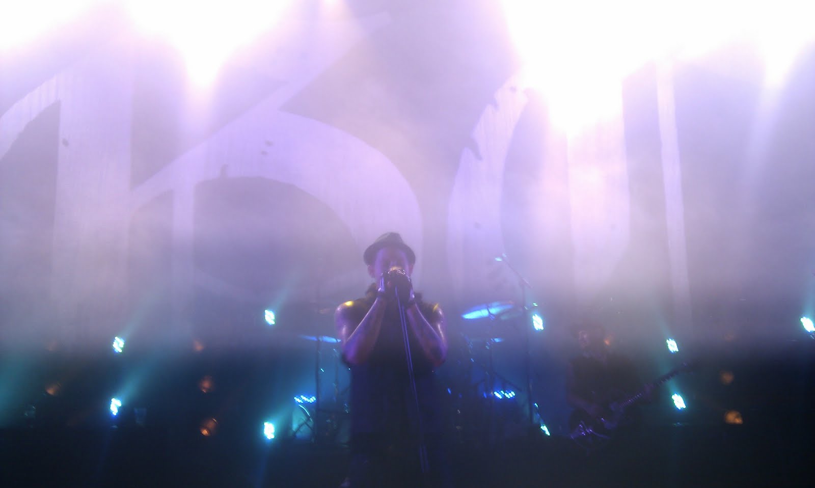
The other subsidiary images on my contents page are images drawing the reader’s attention to the live band reviews. I used images I took myself at live gigs.


For these subsidiary images I did not use Paint Shop Pro like I did for the main image on my front cover, but I did tilt the pictures slightly because I wanted to make the pictures look like they were pinned up on a wall.


1 The Double Page Spread
I improved my first attempt at producing a double page spread by following the colour scheme of the magazine and making the title and the article much clearer. On my first attempt I decided to use the same image that is on my front cover but when I altered the title to make it clearer it blocked the image. Also on my first attempt you couldn’t see the article clearly in places, so I created boxes around the article that followed my colour scheme and now it is much clearer to read. Here you can see the comparison between the two attempts:
First Attempt


Final Attempt
The colour scheme I chose in my final double page spread coincides with the front cover and contents page as the colours yellow, red & black recur throughout my magazine.


The font I used for the title of my double page spread is the same font I used throughout my magazine. As you can see I put the name of the magazine ‘Overdrive’ on every page because it is conventional method in established music magazines, and also I put the website for the magazine on the bottom of the double page spread to show that ‘Overdrive’ magazine is an established multi-platform product, and it is also conventional in music magazines.
The content of my double page spread has question and answer sections and also has an in-depth article about the band’s year. I have created a small introduction that tells the reader some information about the band at the beginning of the article as it is a conventional method in music magazines. I decided to use one main pull quote “We are family now” but I also used pull quotes throughout the article to tell the reader the bands opinion as a fan like myself would like to know the bands thoughts. The title of the double page spread ‘Heads & Tails on their last train home’ I used because they are a welsh rock band like ‘Lostprophets’ who had a single called ‘Last Train Home’.

I used 5 images in my double page spread. I used one main image which takes up the whole page and I used 4 images as a collage on the top of the second page. I tried to make the pictures look like personal photos the band took themselves as I took inspiration from a Kerrang double page spread as you can see below.